
How Digital Asset Management Ensures Readable Font and Brand Consistency
Understanding Brand Identity And Consistency
Brand identity and consistency are crucial elements in building a strong brand. A brand’s identity is the sum of its visual and narrative elements, including its logo, color palette, typography, and messaging. Consistency in these elements helps to establish trust and recognition among customers. When a brand consistently presents itself in a unified manner, it reinforces its brand promise and values, making it easier for customers to connect and engage with the brand. This consistent branding effort ensures that every touchpoint, from marketing materials to customer interactions, reflects the brand’s voice and identity.
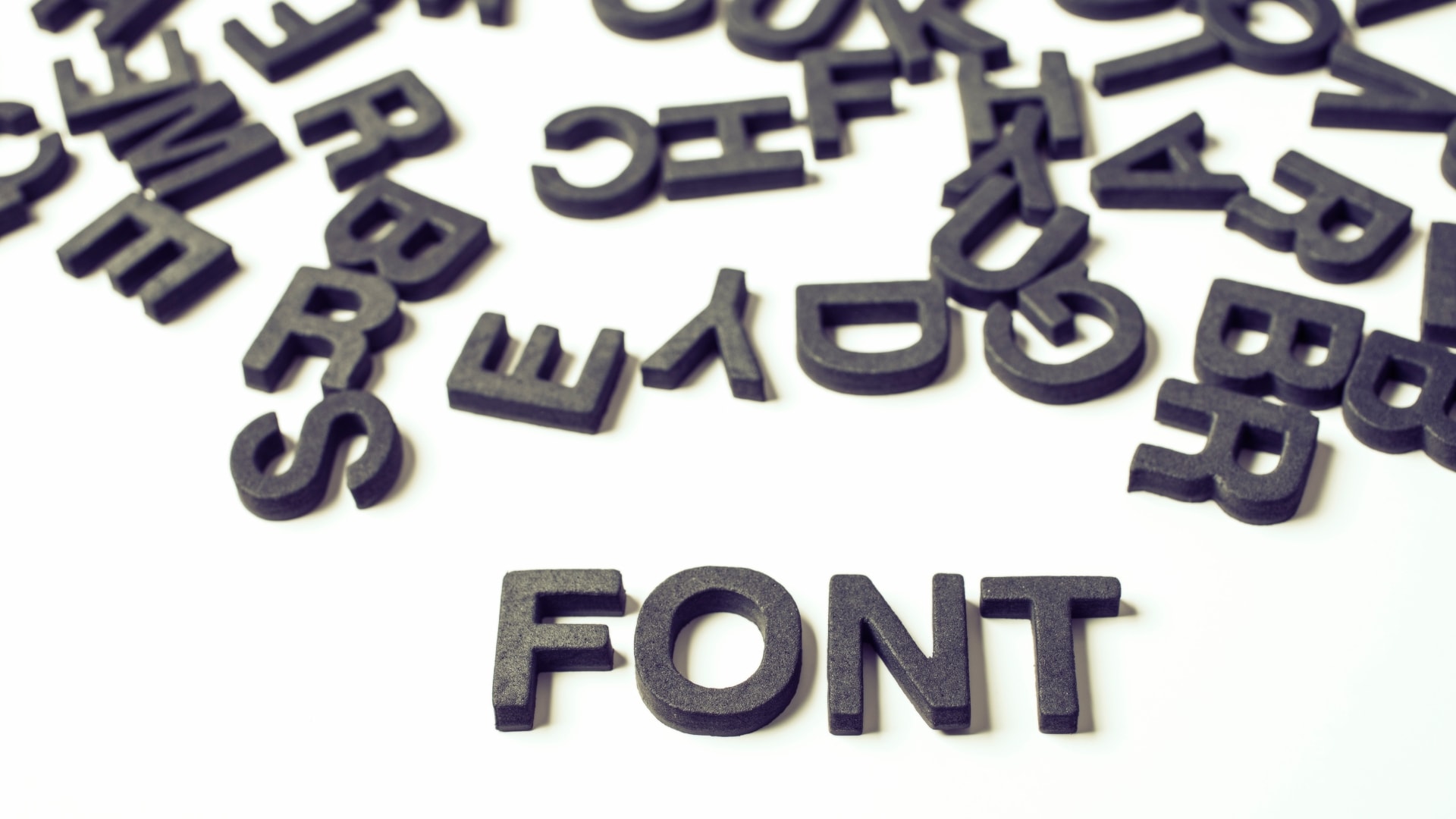
The Role Of Fonts In Branding
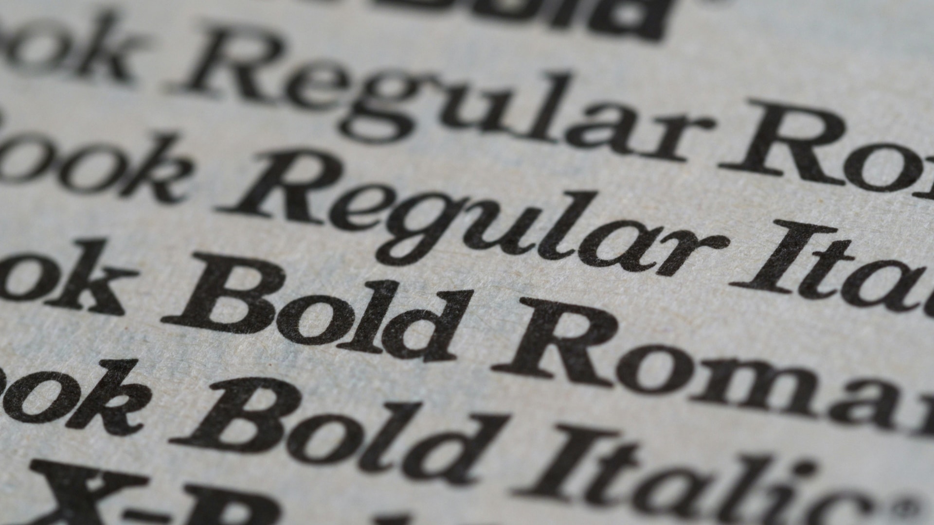
Fonts play a significant role in branding, as they can convey a brand’s personality and values. Sans serif fonts, such as Arial and Helvetica, are popular choices for branding due to their clean and modern appearance. These fonts are often seen as the easiest fonts to read on digital screens, making them ideal for web and mobile content. On the other hand, serif fonts, such as Times New Roman and Georgia, can also be effective in conveying a sense of tradition and professionalism. The choice between sans serif and serif fonts can significantly impact how a brand is perceived, aligning with its brand message and overall identity.
Why Readable Fonts Matter For Branding And Accessibility
Fonts are more than just design choices—they shape how audiences perceive a brand, impact readability, and influence accessibility. The most readable fonts are crucial for ensuring that your content is easily digestible and engaging. A well-chosen font enhances user experience, brand recognition, and engagement across digital and print media.
However, as brands expand, managing font consistency, accessibility, and distribution across teams, agencies, and platforms becomes a challenge. Without a structured system, businesses face:
- Inconsistent typography across marketing materials – weakening brand identity
- Poor readability on digital and mobile screens – leading to lower engagement
- Font mismatches in campaigns and social media – causing confusion among audiences
- Lost or outdated font files – slowing down content creation and design workflows
Solution: A Digital Asset Management (DAM) system like ASMBL centralizes font assets, ensuring consistency, accessibility, and seamless integration across brand materials.
Let’s explore how DAM helps brands manage fonts effectively, ensuring readability, accessibility, and brand integrity.
What Makes A Font Readable And Brand Identity-Friendly?
A readable font ensures that text is easy to understand across different devices, formats, and audiences. Choosing the easiest font can significantly enhance legibility, making it more user-friendly and accessible.
Key Characteristics Of Accessible Fonts
- Sans-serif styles – fonts without decorative strokes are easier to read on screens (e.g., Arial, Verdana, Helvetica)
- Large x-height – taller lowercase letters improve legibility
- Distinct letterforms – clearly differentiated characters reduce reading errors
- Generous spacing – optimal letter and line spacing prevent text crowding
Pro tip: Storing approved brand fonts in a DAM system like ASMBL ensures teams use consistent, accessible typography across digital and print materials.
Creating A Brand Style Guide For Consistency
A brand style guide is a document that outlines the rules and guidelines for using a brand’s visual and narrative elements. It ensures that all marketing materials, including websites, social media, and advertising, consistently reflect the brand’s identity. A comprehensive brand style guide should include information on typography, color palette, logo usage, and messaging. By providing clear guidelines, it helps teams maintain consistent branding across all platforms, ensuring that every piece of content aligns with the brand’s voice and values.
Ensuring Brand Consistency Across Marketing Channels
Ensuring brand consistency across marketing channels is crucial for building trust and recognition with customers. This can be achieved by using a consistent brand voice, visual elements, and messaging across all channels. Brands should also ensure that their website, social media, and advertising materials are consistent in terms of design and tone. By maintaining a unified appearance and message, brands can reinforce their identity and values, making it easier for customers to recognize and trust them. Consistent branding across all touchpoints helps in delivering a cohesive brand experience, enhancing overall brand recognition.
Real-World Examples: How Brands Use DAM For Font Management
1. Global Brands: Ensuring Brand Consistency Across Regions
Challenge: A multinational company struggles to enforce typography guidelines across marketing teams and agencies.
Solution: A DAM system stores all approved fonts and typography guidelines, ensuring every campaign, ad, and website uses consistent typography.
Example: A retail brand uses ASMBL’s DAM to manage brand fonts across product packaging, digital ads, and in-store signage—ensuring a cohesive brand experience worldwide.
2. Creative Agencies: Managing Multiple Client Typography Styles
Challenge: Agencies handle multiple clients, each with different font styles and branding requirements.
Solution: A DAM system organizes client-specific font files, making them easily accessible for designers, copywriters, and content creators.
Example: A design agency uses ASMBL’s DAM to store typography presets, ensuring that every project aligns with the correct brand identity.
3. Digital Publishers: Optimizing Fonts For Web Accessibility
Challenge: A media company needs to ensure its articles, blogs, and mobile content are accessible to all readers, including those with visual impairments.
Solution: A DAM system categorizes and distributes accessible font choices, ensuring that all content meets readability and accessibility standards.
Example: A news platform uses ASMBL’s DAM to implement accessibility-friendly fonts across web and mobile platforms, improving user experience.
How A DAM System Simplifies Font And Branding Management
Without A DAM System, Businesses Struggle With:
- Inconsistent font usage across different teams and campaigns
- Lost font files, causing delays in content creation
- Difficulty in enforcing brand typography rules across platforms
How ASMBL’s DAM-Powered Font Management Helps:
- Centralized font repository – stores and organizes all brand-approved typography in one place
- AI-powered search & tagging – quickly locate and apply the correct fonts for projects
- Automated typography guidelines – ensures teams use the right font styles for different use cases
- Version control & permissions – prevents unauthorized edits or outdated font usage
Lesson: A DAM system eliminates font inconsistency, making brand materials more readable, accessible, and visually aligned across all platforms.
The Impact Of Inconsistent Branding On Business
Inconsistent branding can have a negative impact on business, as it can lead to confusion and mistrust among customers. When a brand’s visual and narrative elements are inconsistent, it can make it difficult for customers to understand and engage with the brand. Inconsistent branding can also lead to a loss of brand recognition and loyalty. Customers may struggle to identify the brand, weakening the brand’s presence in the market. To avoid these pitfalls, businesses must ensure that all brand elements are consistently applied across all platforms, reinforcing their brand identity and message.
Best Practices For Managing Fonts With DAM
1. Store And Organize Fonts In A Single DAM System
Keep all brand-approved fonts in a centralized library with easy access for teams
Use metadata tagging to categorize fonts by type, usage, and accessibility compliance
2. Ensure Brand Compliance With Typography Guidelines
Link font files, including serif font options like Georgia and Merriweather, to brand guidelines stored in the DAM system
Automate font approvals and version control to prevent unauthorized changes
3. Optimize Font Accessibility For Digital Platforms
Ensure typography meets web accessibility standards (ADA, WCAG 2.1)
Use DAM analytics to track which fonts perform best in user engagement
4. Enable Seamless Font Distribution For Teams And Partners
Allow marketing, design, and content teams to access fonts instantly via DAM
Prevent file loss or duplication by managing font licenses and updates centrally
Why ASMBL Is The Best DAM For Font And Brand Management
If your brand struggles with inconsistent typography, lost font files, or inefficient workflows, ASMBL provides the ultimate DAM solution for font and brand asset management.
What Sets ASMBL Apart?
- AI-powered search & tagging – instantly find and organize fonts and brand elements
- Automated approval workflows – speed up typography updates and branding consistency
- Version control & permissions – ensure teams always use the latest brand-compliant fonts
- Secure access controls – prevent unauthorized edits or font misuse
- Seamless integrations – works with Adobe, Canva, wordpress, and creative tools
With ASMBL’s DAM, brands can maintain typography consistency, enhance readability, and create visually cohesive content across all channels.
The Future Of Brand Typography: Why Brands Must Act Now
Inconsistent font usage leads to weakened brand identity, accessibility issues, and lost customer trust. Brands that fail to manage typography efficiently risk losing engagement and credibility.
A DAM-powered font management strategy ensures brand consistency, faster workflows, and better readability—keeping businesses ahead in competitive markets.
If your brand struggles with font inconsistencies, lost files, or inefficient content workflows, it’s time to upgrade.
Discover how ASMBL’s DAM helps businesses centralize, manage, and enforce typography effortlessly.


